By MOLLY WOOD, New York Times
Motorola’s Moto 360 smartwatch wowed when it was announced last March, and it has been talked about ever since as the smartwatch you might actually want. The main reason? It looks good. Really good, in fact.
Now that the Moto 360 has finally arrived, just days before the expected announcement of Apple’s smartwatch, it largely delivers. The $250 watch is elegant, attractive and works with Google’s promising Android Wear software. Its only drawback is that, well, it just doesn’t do very much.
I was disappointed with Android Wear on the LG G Watch, and it still has some usability kinks to work out, and could use a lot more useful apps. But what a difference the hardware makes.
This is a watch I would actually wear.
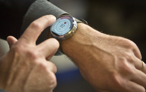
The Moto 360 is as lovely as its previews suggested. The round watch face makes all the difference: It looks and acts more like a normal watch, with an unadorned bezel, other than a raised power button on the side like you’d expect with any watch design.
It offers multiple watch faces built in, ranging from a minimal design with no numbers to a full digital readout to chronograph dials and even a bright white classic watch face.
The Moto 360 comes in three colors: black on black, silver with a dark gray suede band, and silver with a light gray band. I tried the black leather band and dark gray suede, and found the silver and gray combination distinctly more attractive.
Extra bands are available for $30 and a version with a metal band will be introduced later this fall.
The watch face itself is certainly not small, but it doesn’t hang off your wrist. The watch is lightweight and comfortable to wear.
The package includes a wireless charging cradle, and the watch can actually charge on any wireless charging pad that uses the Qi standard. It has a heart rate monitor on the bottom, and can measure activity and steps.
While the Moto 360 is the nicest of the current smart watch crop, it’s certainly not perfect.
For one thing, the big round watch face is a magnet for fingerprints. Every time I tapped to read an incoming message or swipe through notifications, I cringed and wiped down the screen.
In addition, the screen almost always displays some kind of notification card, whether a tweet or a calendar item or a recent email.
I’d rather tap to see notifications than have them be persistent, partly for privacy reasons. Because the watch is big, I felt like anyone could look over my shoulder and see the name of whoever emailed me, or the location of my next appointment. Plus, they’re visually unappealing on such a nice watch face.
You can swipe them all away, but it takes some doing if there are several.
Notifications are subtle. There’s very little buzzing or beeping. However, notifications for things like incoming calls didn’t work every time, and the watch frequently disconnected from the phone.
Also, in order to see or respond to incoming text messages, you must change your default text app to Google Hangouts, which I find annoying.
As I’ve previously written, Android Wear itself has a little ways to go before it finds its purpose. I do like Google Now’s contextual notifications, but not as ugly cards overlaid on an elegant watch face.
Voice controls are nice to have, like the ability to set reminders or initiate a phone call. The Moto 360’s microphone seems more accurate than the one on the LG G Watch, but it’s not as good as my phone.
Battery life on the Moto 360 is not great. It lasts a little more than a day, and that’s with the screen turned off until you activate it to see the time. You can leave the watch on ambient screen mode, where the time is always visible, but that reduces battery life even more.
One solution I found was to keep the charging cradle at work instead of at home. The watch charges quickly, so if I’m just sitting at my desk typing or making calls and I don’t need time checks or notifications, leaving it on its cradle to charge between outings seemed like a good solution — and one that didn’t consume yet another outlet in my home.
Ultimately, the Moto 360 shows that simply not being ugly helps make a smartwatch much more appealing, even if it lacks an obvious killer app. If you’re an Android user looking for a smartwatch to try out, the Moto 360 is the best option available — for now.

